
Russian data-visualisation designer Ruslan Enikeev has mapped 350,000 websites and 2 million links from 196 countries according to levels of activity and the other sites visited by their users. Each website is represented by a circle. The size of the circle is determined by website traffic. The color of the circle is determined by countries (for example US is blue, Canada is purple). The gaps between the circles are determined by the frequency the users go from one site to the other.

From Ruslan Enikeev:
As one might have expected, the largest clusters are formed by national websites, i.e. sites belonging to one country. For the sake of convenience, all websites relative to a certain country carry the same color. For instance, the red zone at the top corresponds to Russian segment of the net, the yellow one on the left stands for the Chinese segment, the purple one on the right is Japanese, the large light-blue central one is the American segment, etc.
Importantly, clusters on the map are semantically charged, i.e. they join websites together according to their content. For example, a vast porno cluster can be seen between Brazil and Japan as well as a host of minor clusters uniting websites of the same field or similar purposes.
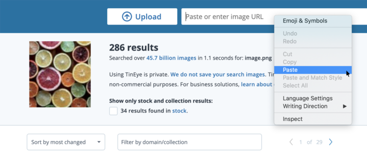
Spot TinEye?