Many of our TinEye fans have asked us about the history of the TinEye robot, if the robot has a name, how was it created? and if TinEye itself was inspired by Brandon Sanderson’s Mistborn trilogy (it was not). So we thought to start off the new year we would reminisce with Stephen DesRoches about creating the TinEye robot. We invited Stephen to tell you the story from his designer perspective.
We love robots, machines, and all things mechanical. In fact, our TinEye office is filled with mechanical friends! A little history: back in 2000 when we were brainstorming cool names for our image recognition technology, it was no surprise that robots came to mind. Not just any robots, but those awesome tin toy robots of yore. Yes, futuristic robots trump our human abilities in so many ways: their tin arms are stronger, their tin brains are faster, and their ‘tin eyes’ are keener… Et voilà, the birth of TinEye! Well not really, as when we registered TinEye in the year 2000 – oh that has a nice ring to it – there was no TinEye, no reverse image search engine and no image recognition breakthroughs yet. There was a team, excited about changing the world of image search, and the rest as they say is history! So grab a coffee and let’s journey back in time with Stephen.
Talking about robots
It was 2003 when I first met Leila and Paul during a demo of their pretty amazing image recognition technology. The idea of searching for images with other images was a new concept for me but as this technology advanced and we (silverorange and Idée Inc) became friends, it was not long before we were working together.
Fast forward to when TinEye was being developed and prepared for the world stage, I was given the opportunity and challenge to create a mascot, a logo, and an identity for the service: reverse image searching. This brand needed to represent speed and efficiency. It also needed to be friendly and have a great personality. TinEye’s reverse image search was magical and I needed to create a brand to impart that magic. Given the team’s love for robots, magic and speed, we all very quickly converged on a robot. But what kind of robot?
Drawing a robot
TinEye is a fun brand but a mysterious one. While fun — it’s not childish. It’s fast, but comes with a level of mystery. Most of us could not explain how the TinEye technology works (well of course except the engineering team). We just accept and expect that it does. So how can we illustrate all of this with a single mascot brand?
The sketches
Starting is always difficult. I can spend days simply thinking about possibilities before ever picking up a pen. As a first step, I allow ideas to come and go while randomly throwing everything down on paper. Here are some of those initial ideas.

Quick drawings
And from that long list, we start to eliminate. Everything that doesn’t work for any reason at all has to go. One round at a time, we narrow the potential candidates down.
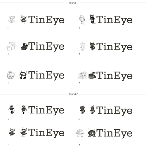
From round 1, some of the robots we had a hard time eliminating included these, specially the sorting robot at his desk:
 Our round 2 favourites included:
Selecting just one
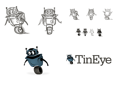
After much debate, the speedy one wheel robot won us all over. It was time to focus and expand on that single concept. How would this robot look in full color?
Adjustments and final revisions
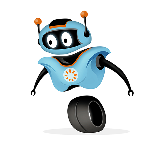
The problem with the robot above was that he didn’t look fast. He was heavy looking missing the goals of speed and efficiency. Below is the finalized robot. With small adjustments to a slightly more football-player-like shape, the slimmer and lighter colours were necessary improvements.
Speed? Yes. He could out run all of us.
Efficiency? Yes. Flexible rubber-like arms great for picking images.
Magical? Yes. How do the floating parts stay together?
Friendly? Yes. Well, he sure doesn’t look evil.
Personality? Yes. Loads of it!
Playing with emotion
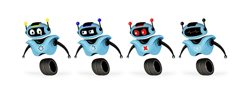
The eyes are very powerful. The entire mood of an illustration can be altered by changing only the eyes and nothing demonstrates this better than the Pixar film Wall-e. A story without words but full of emotion. This alone provides the opportunity to use the robot in unique ways throughout the TinEye site.
Dissecting the illustration
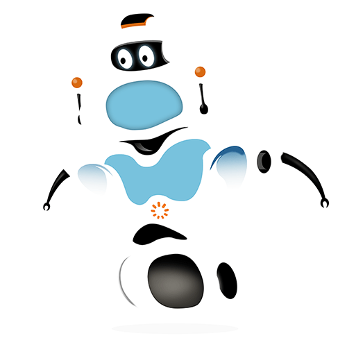
At the root of all illustrations, it’s simply a stack of individual shapes (mostly created with the pen tool). Here is a look at all those layers and a fun way to see how TinEye was created.
TinEye Services for Business
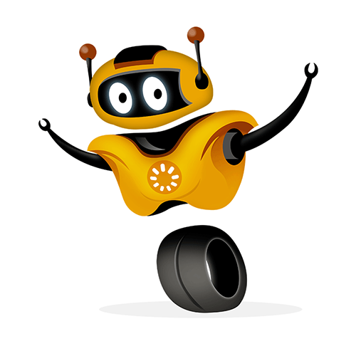
Now that we look back at 2012, We spent the better part of the year working on TinEye Services for Business. This gave me the chance once again to experiment with many more fun story lines… and colour.
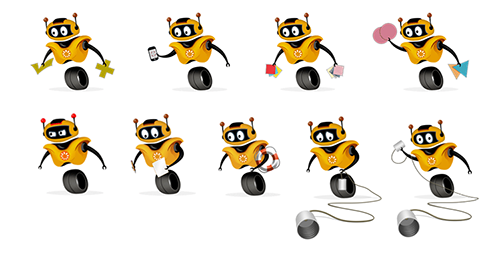
TinEye labs
And of course, TinEye Labs, a place to show off current and future technologies and projects.
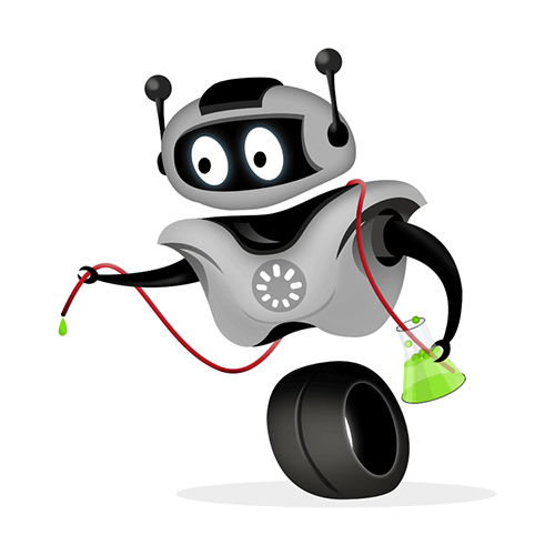
A diversion
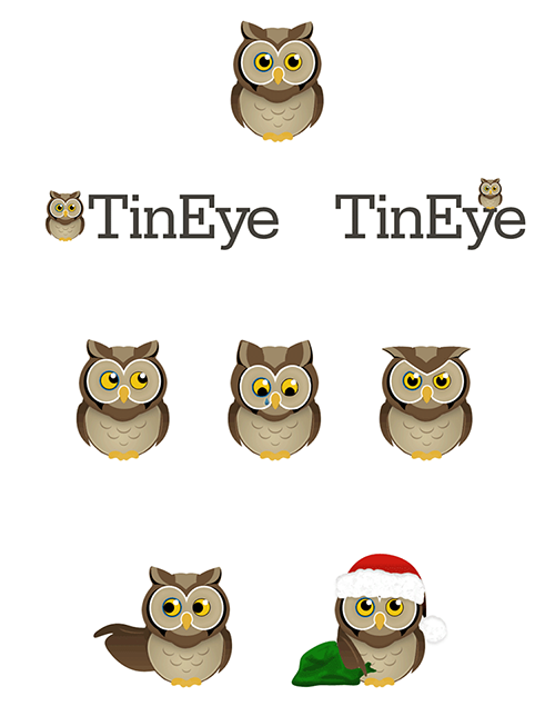
If you know the TinEye team, you will know that they are super friendly to wildlife and in addition to robots have a passion for animals. This is of course awesome when your office includes a garden where wildlife can be observed, but perhaps not such a good thing when you are building a new product brand. In the midst of our robot designs we decided — as a team — to experiment with an owl.
In design – very much like software development – going from point A to point B is not always done through a clearly defined road. On the path to the TinEye robot, our strongest alternative contender was an Owl. To create the owl – there are many types of owls – we started by drawing a series of owls and eliminating the ones we did not like or were difficult to build into a character. A lot of work and efforts but this was necessary for consideration but proved and confirmed our robot was the right choice. Here is the mascot that could have been TinEye. We can’t imagine TinEye not being a robot!
